
.png)
.png)
.png)
How green influences buying decisions & why smart brands value it more now
Think green only stands for eco-friendly? Think again. The colour green psychology of greens plays a much bigger role in how brands are seen. Discover and learn about the emotional and cultural impact of green and how it can subconsciously shape a customer's opinion before any word is said.

Colour plays a far more strategic role in marketing than someone might notice. What makes colour unique is the feeling it gives. In the end, colour isn't simply an aesthetic. Colour is about psychology and behavioural influence.
When building a brand identity, understanding how colour shifts consumer response is vital. Green is a special colour in branding since it is versatile, has strong emotions, and appeals to many people.
This blog looks at how green functions in brand strategy, including psychological associations and cultural relevance. Many brands use green to show trust, growth, and responsibility.
Why green holds a unique position in marketing
Green is special in colour psychology. Because of its calming effects and the mental clarity it brings. It promotes a sense of being stable, natural and trustworthy.
In visual communication, green does many things at once. It evokes a sense of affluence or simplicity while at the same time, innovation and tradition. This chameleon-like ability makes green particularly valuable in branding, especially when a company wants to balance their identity between authority and approachability.
This is different from more intense colours like the colour red.
The psychological impact of green
From a psychological standpoint, green is strongly associated with balance, calm, and reassurance. People often associate different shades of green to nature, renewal, and growth. This leads to strong links with health, sustainability, and ethics.
Studies have shown that spending time in green spaces can have real benefits. It can lower stress, reduce heart rate, and improve focus. That's why people often use green in places that need calm focus. This is especially true in industries like healthcare or wellness.
In marketing, this means a visual sign that tells people: this brand is safe, reliable, and trustworthy.
Different shades, different messages
The tone of green selected can significantly alter how a brand is perceived. Each variation communicates something slightly different:
| Shade of green | Implied message | Brand contexts |
|---|---|---|
| Forest/dark green | Wealth, security, prestige | Finance industry, high-end products |
| Lime/neon green | Creativity, boldness, modernity | Tech, start-ups, lifestyle brand |
| Olive/sage | Sustainability, mindfulness, authenticity | Eco-products, organic goods, beauty brands |
| Mint/soft green | Cleanliness, calm, freshness | Skincare, healthcare, wellness |
This makes green a flexible but strategic choice for companies wishing to use it. A luxury financial services firm might choose a deep green to convey heritage and stability. On the other hand, a plant-based drinks brand might select something lighter and more energising.
Cultural interpretations of green
Also worth noting is that colour carries cultural baggage. In Western contexts, green is most commonly associated with nature, money, and health. In Islamic cultures, people closely tie it to religious tradition and reverence. In some Asian cultures, its meaning can range from fertility to cheating, depending on the context.
Due diligence is essential when choosing a colour for the corporate identity. A colour choice that conveys sustainability and wellbeing in one market might carry entirely different connotations elsewhere.
The role of green colour psychology in corporate identity
Selecting green as a primary brand colour is more than just a design choice - it's a signal of intent. It helps shape perception at a glance. For new companies creating a brand identity or existing ones rebranding, green can provide a strong foundation. It supports both emotional and strategic messaging.
When used regularly in brand materials, it helps shape how customers view the business. Different branding materials include, but not limited to, logos, website design, product packaging, and advertisements. Over time, this creates a layer of closeness that builds trust and ultimately leads to brand loyalty.
When and why brands turn to green
Brands generally turn to green when they want to project or convey:
- 🌍 Environmental responsibility – often chosen by eco-conscious companies or those offering sustainable goods and services.
- 🍏 Health and wellness – used frequently in the food, beverage, and pharmaceutical sectors to indicate natural ingredients or restorative qualities.
- 🤑 Stability and wealth – especially in financial services or premium retail brands aiming to convey value, trust, and legacy.
What connects these sectors is not just the industry. The emotional outcomes they want to inspire are trust, wellbeing, and growth.
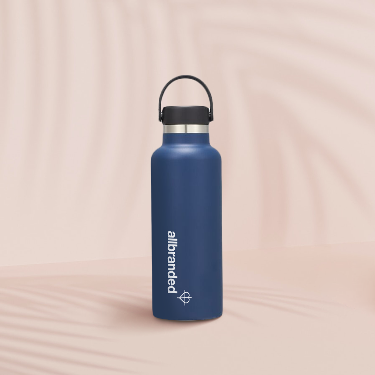
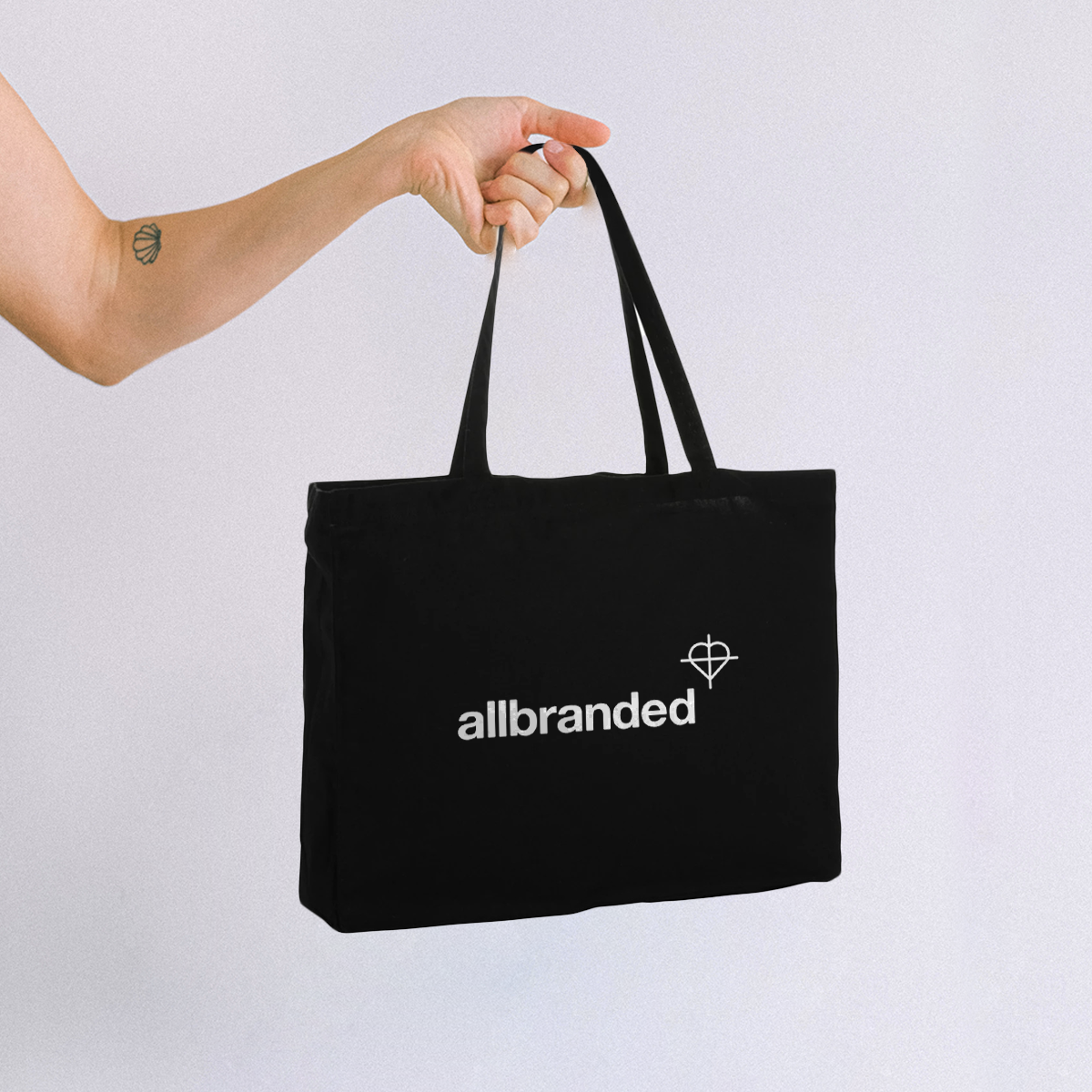
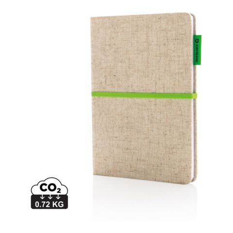
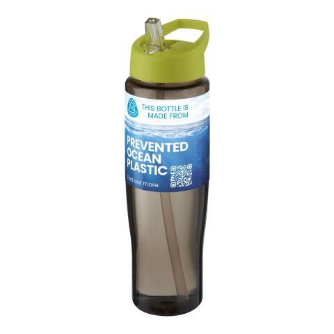
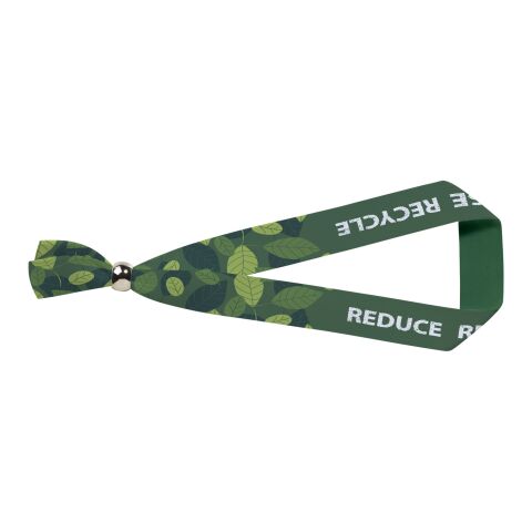
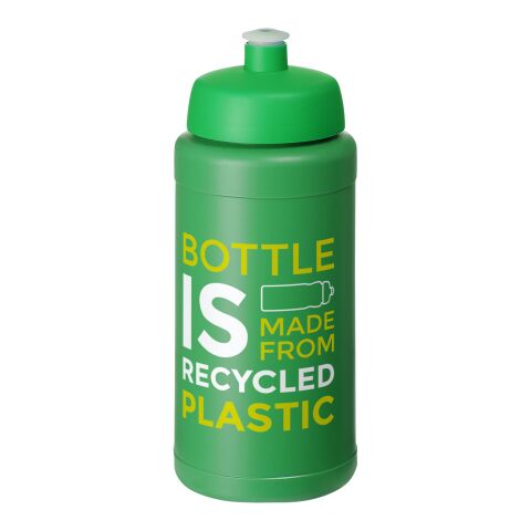
Green in offline marketing: Merch and promotional items
Beyond the screen, colour also plays a key role in tangible brand touchpoints such as promotional products. A cotton tote or notebook printed with a company logo can carry more than just branding. It reinforces a message of environmental responsibility, quality, or calm. Especially when the product or logo itself is green.
The product material also enhances the message. Recycled paper, natural fabrics, and sustainable packaging all match the green colour scheme. This shows interest in eco-friendly products and topics and a pledge to do better.
For businesses offering promotional merchandise, matching colour psychology with material choice is a powerful way to turn something functional into something meaningful. Including branding the company as one that focuses on being eco-friendly.
Promotional products available in green


Green as a long-term branding asset
In a market where trust and trustworthiness matter more than ever, green is still a smart colour choice when considering the future. It outlasts trends, appeals to people's emotion, and allows for many uses across markets and mediums.
Green is a colour that helps a brand in many ways. It shows financial security, eco-friendly values, and a calm, welcoming feel.
For professionals who want to create a visual identity, green is more than just a colour choice. A valuable tool connects with customers and shows important brand values.