Our Pantone matching system colour chart will focus your brand image
Sometimes, the colour options offered do not exactly fit your desired colour schemes for your company logo or branding message. If you want to be sure you are getting the perfect colour for your promotional merchandise, use our Pantone colour cards to get the perfect match for your brand’s colour identity.
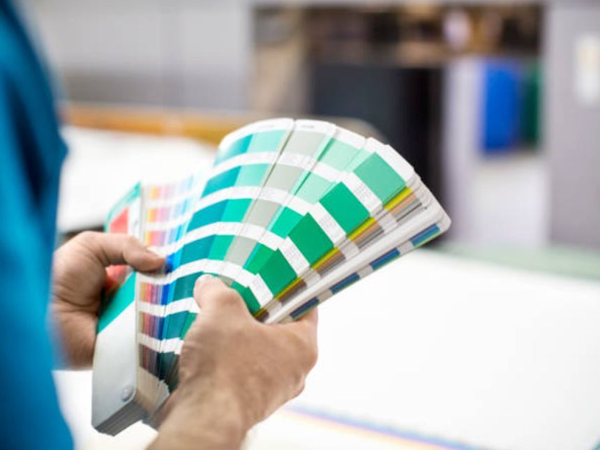
First off, what is Pantone?
Pantone colours refer to the colour codes of specific colours within a given spectrum. The colours are defined by a specific code, so the options are quite vast. By essentially standardising the language of colours for any medium from digital to physical, those interested can fine tune their desired colours. This is important for brands that can’t settle for anything less than the perfect colour.
Having your promotional merchandise custom made to your exact colour requirements offers many benefits. For some of our products, we can use our colour chart to get an exact colour code that matches your brand.
Why is it important?
One of the biggest use cases for the Pantone colour guide is for textiles. Clothing is so important for branding and getting the colour just right has its challenges. For example, your mental idea or view of a crimson red may be different from someone else's view of a crimson red - it could be blood red or . The exact colour won't always match. This is where a coded colour comes into play.
However, clothing isn't the most important thing to take from using our Pantone colour card. If you have a brand that puts your brand colours on different types of products, having a unified code that is not open to interpretation is important. This is the reason why saying your is Pantone 7628 C, instead of crimson red - this can't get lost in translation to your design or brand management team.
Being one of a kind is crucial
The promotional branding industry isn’t getting any smaller, in fact, with more and more businesses realising how important brand awareness is, being able to stand out is vital for success. As more and more businesses buy into the idea of promotional goods, then there is a natural escalation of products produced and sold that end up looking a little too similar. Having your order matched to your brand pantone colours offers a uniqueness and bespoke feel that you can’t get with a standard black tote bag for example.
Avoid anesthetic colour clashes
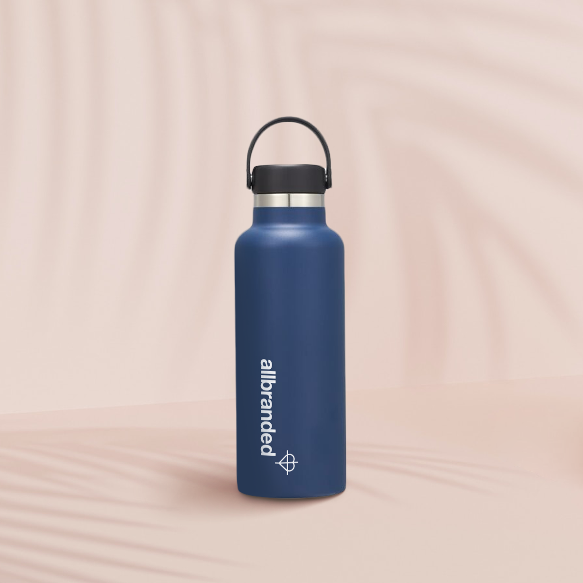
It’s a complaint that we're all too familiar with; “The red in my logo doesn’t match the red of the water bottle”. We’re happy to match the marketing product you’re after to the logo in question. The best tool for that is the Pantone colour guide. We can work with you directly on this.
I love the product but none of your colour options work for my brand…
Oftentimes the brand merchandise we can get our hands on are only available in a handful of stock colours. If you’ve fallen in love with the design of a certain product but it isn’t made in the colour you’re after, throw us a line and we can work with you directly on this.
We hope that this inspires you to not settle for colours that don’t fit your brand exactly. After all, color psychology, especially in marketing is very important. We want to help you have the perfect promotional merchandise that will elevate your branding initiatives. Thanks for reading, and please feel free to reach out to us if you have any questions about our services!

.png)
.png)
.png)
